This painting is 18" x 22" and approx. 120 hours.

I created this set-up for the reference photo using the same doll and beetle from “My Best Friend.”

A quick sketch to get the placement.

Blocking in color. Trying some new
Nova Color Paints. Emerald (pearlescent) in the background, Portrait Tone on the skin, and (I think) Indanthrone Blue on the ground.

Adding a “wash,” well, more of a scrap of blue over the emerald background, and defining some of the shapes and shadows.

Blocking in more color. At this point it is basically a play of complimentary colors. Mapping out the grid on the floor.

A fun chrysanthemum pattern in the background. I really like that element to the painting. The bold pattern gives the piece a lot of movement and energy.

Adjusting the flesh tones, added a little nose because his head didn’t seem to be facing the bug, and a vital part of the concept was the interaction between the doll and the bug. The basic idea was this bug lecturing the doll and telling him no “Ifs, ands, or buts!” This is a perfect example of my kooky sense of humor.

Oh, the dots…They really added a lot of texture to the background, and I really liked how the metallic emerald and the blue glimmer through the green dots, but man, those took a crazy amount of time, and I had to go over them several times to get the color built up to the level I liked.

I wanted the flowers to pop out a bit more, so I added an outline of metallic pink.

Gash and Ti hanging out with the painting in the studio.

Bringing some more color and reflections to the glass, and blocking in the ground tiles better.

I wasn’t so sure about the zebra coral pattern at first, but with a few glazes, I began to really like the effect. Also fixed some of the rocks in the jar to give them more volume.

Defining the jar more. As I have stated before, I have never been one for straight lines or perfect angles, but I enjoy a challenge, plus I think they are wonder metaphoric tools. Every time I work on one of the jars, it is a new adventure. In hindsight, I wish I had left the jar at this level, but I kept playing with the idea of a beveled glass, which I am happy with, but I think this phase was really nice and clean.

Baby boy get a pattern inspired by cherry blossoms. I love mixing the different patterns. I am trying to keep a balance between just enough and too much under control.

I had just picked up a jar with beveled edges at the thrift store, so I had bevels on the brain, but it created a whole lot of chaos. The addition of the plants soften the tiles and encourage the eye to move upward.

Still dealing with the glass. Adding details to everything.

The vine seemed like the perfect solution to hide a bit of the bevel craziness and add color and movement to the piece. I think it really makes a huge difference.

Getting rid of some of the flat, white glass, and fixing the details on the vine.
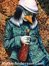
View the finished piece
No Ifs or Ands