Tuesday, May 5, 2009

©POP Gallery Opening 05:02:09


Me standing in front of "Artemisia, Artis Magistra (Mistress of Art)" by Isabel Samaras. I have admired her work for a very long time, but this was the first time I got to see one in person. Now I am even more enamored with her work and super excited to get her book, "On Tender Hooks."


Someone, NOT US, used the H.R. Giger ped as a resting spot for his beer, but we thought it was a perfect opportunity to show the scale of the piece.


Taking a bite out of ©POP! Just a sampling of the tasty treats provided. I also was a big fan of the edible shots in chocolate shot glasses.


Cheers! Great local brew by Motor City Brewery. REALLY good stuff!


Mark says "Hang Loose!" Fred says "???"


Mark and Jen in all her beautiful, baby glory!


"Blind Faith" next to Bask.


Colin and Jen using 3D glasses to check out a seriously freaky Eric White, 3D print.


Tom Thewes and The Pizz in front of The Pizz's piece, but close enough to spit on mine! Yes, I am a stalker photographer.


Amazing prints by Shepard Fairey.


My fav piece by Tom Thewes.


Mark's fav piece by Tom Thewes. "BÄDguys"


Work by Glenn Barr. Even more amazing in person! Got to see him, his wife and daughter, but too chicken to say hi. Gotta work on that. :)


©POP Gallery already has new occupants.


Winner for best signature, Laura Bernhard. (Her work is amazing too!)


Drooling over, around and under the work of Stephanie Henderson. "Non Omnis Moriar"


Ended the night with my head "deep inside" Jerry Vile. It smelled nice! Haahaa!

Friday, March 13, 2009

March News


HELLO!

VIDEO: Exciting news! Remember the 3 second teaser for "Weevil?" Well, now you can view the full, high res version on my site or the low res version on YouTube. I already have plans to make another video using everything we learned during the making of this vid, so it should be even better! Many thanks to my amazing husband for his help and his MUSIC!

CD RELEASE PARTY: David E. Williams released his newest album, Every Missing Duck is a Duck Missed on Friday, February 28th in Philly. Check out his myspace blog for more info on the event. This is my second CD cover, Sleepybird's All Things Are Mine being the first. I am thrilled to be a part of both band's success. David's Cd is being reviewed in the UK's online zine called, Judas Kiss. Check back for the complete review, but get your dictionaries open and check out this lovely review of my work by Simon Collins...

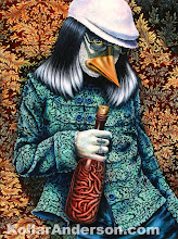
"The cover artwork of Duck…’s digipack sleeve is by Amy Kollar Anderson. It’s a disturbingly detailed image of a seedy anthropomorphic duck in 60s psychedelic hipster drag, clutching a bottle of writhing worms, and it’s brilliant, even if I must admit to having pedantic ornithological reservations about the shape of the duck’s beak."

NEW MEMBER: I am a new member of two groups on DeviantArt, Painters, and Dark Art Asylum.

CURATE: In February, I worked with the Dayton Area MetroParks, during their Adventure Summit on a project called ARTventure. The gallery in the Student Union at Wright State was filled with amazing art inspired by nature. I am planning to help with this event next year, but create a call for entries, and open the event to more of the community. Check out pics from the event on my Lowdown page.

COMMUNITY: Do you like SALVADOR DALI? If you are in the Dayton area on Saturday, March 14th, Join us for the grand closing "Dali Costume Ball" (benefit for Justin King) @ 7 Timbers (next to second street market) on 32 Webster St. Dayton, OH from 8pm to midnight. For only $10, you not only get to view some rare Dali lithographs, you get entertained by Dayton's amazing band, Sleepybird, and a performance by the Zoot Theatre Company. Do some anonymous people watching from behind your Dali inspired costume, drink and be merry all while helping out Justin King. This benefit event will help Justin, who suffers from Cystic Fibrosis and is in need of a liver and double lung transplant.

Have a great weekend!

Amy Kollar Anderson
www.KollarAnderson.com

Tuesday, January 27, 2009

My painting on a CD by David E. Williams!


Check out "Worm Wine" on the cover of "Every Missing Duck is a Duck Missed" by David E. Williams! Give it a listen, and purchase it from his site. Good stuff!!!

“Tragedy renders the monster human. Williams' 5th full length release is decidedly his most eclectic. Largely inspired by the grief and futility following the illness and death of his girlfriend, the album veers from somber piano ballads to nostalgic pop to at least one grandiose epic with virtuoso live drums, odd time signatures and dissonant tone clusters (while still remaining catchy!) Longtime cohort Jerome Deppe gets the longest guitar solo of his career as well as his VERY FIRST harmonica solo (in the deceptively titled hoedown "Kill Yourself in Cape May"). There are also 4 cover tunes and a witty Zevonesque take on the life of Idi Amin. A local and national cast of musical luminaries* fleshes out the sound of David at his most organic and confessional.”

Tuesday, January 13, 2009

No Ifs or Ands : Analyzed

This painting is 18" x 22" and approx. 120 hours.


I created this set-up for the reference photo using the same doll and beetle from “My Best Friend.”


A quick sketch to get the placement.


Blocking in color. Trying some new Nova Color Paints. Emerald (pearlescent) in the background, Portrait Tone on the skin, and (I think) Indanthrone Blue on the ground.


Adding a “wash,” well, more of a scrap of blue over the emerald background, and defining some of the shapes and shadows.


Blocking in more color. At this point it is basically a play of complimentary colors. Mapping out the grid on the floor.


A fun chrysanthemum pattern in the background. I really like that element to the painting. The bold pattern gives the piece a lot of movement and energy.


Adjusting the flesh tones, added a little nose because his head didn’t seem to be facing the bug, and a vital part of the concept was the interaction between the doll and the bug. The basic idea was this bug lecturing the doll and telling him no “Ifs, ands, or buts!” This is a perfect example of my kooky sense of humor.


Oh, the dots…They really added a lot of texture to the background, and I really liked how the metallic emerald and the blue glimmer through the green dots, but man, those took a crazy amount of time, and I had to go over them several times to get the color built up to the level I liked.


I wanted the flowers to pop out a bit more, so I added an outline of metallic pink.


Gash and Ti hanging out with the painting in the studio.


Bringing some more color and reflections to the glass, and blocking in the ground tiles better.


I wasn’t so sure about the zebra coral pattern at first, but with a few glazes, I began to really like the effect. Also fixed some of the rocks in the jar to give them more volume.


Defining the jar more. As I have stated before, I have never been one for straight lines or perfect angles, but I enjoy a challenge, plus I think they are wonder metaphoric tools. Every time I work on one of the jars, it is a new adventure. In hindsight, I wish I had left the jar at this level, but I kept playing with the idea of a beveled glass, which I am happy with, but I think this phase was really nice and clean.


Baby boy get a pattern inspired by cherry blossoms. I love mixing the different patterns. I am trying to keep a balance between just enough and too much under control.


I had just picked up a jar with beveled edges at the thrift store, so I had bevels on the brain, but it created a whole lot of chaos. The addition of the plants soften the tiles and encourage the eye to move upward.


Still dealing with the glass. Adding details to everything.


The vine seemed like the perfect solution to hide a bit of the bevel craziness and add color and movement to the piece. I think it really makes a huge difference.


Getting rid of some of the flat, white glass, and fixing the details on the vine.

View the finished piece No Ifs or Ands

Saturday, November 15, 2008


VIDEO:I am currently working on a submission for theThe Dirty Show X in December. Instead of just photographing the progress, Mark (and Proffit!) helped me set up the video camera so the entire process will be documented. Right now, I only have about 10 seconds worth of video, but I am really excited to see it all come together. Check this SUPER QUICK, 3 second teaser on YouTube.

PURSES: If you are in Dayton, check out the Art to Buy gift gallery at the Dayton Visual Arts Center. I am selling my painted purses there until December 18. Lots of great x-mas ideas from talented local artists.

ARTICLES:If you missed the show, Under Glass,I have some excellent REVIEWS by Jud Yalkut and Pam Dillon on my site.

IN PROGRESS:In addition to the piece for the Dirty show, I have three new Vivarium pieces in the works; Cultivate, Chain of Events, and The Ups and Downs of Death.

Saturday, August 16, 2008

Gallery Exhibit


I will be showing the new Vivarium Paintings, some drawings, and a few surprises...

The opening is September 5, 2008
5pm-10pm

Goloka Gallery: Oregon Division
523 Fifth Street
Dayton, OH 45402


View Larger Map

Sunday, June 8, 2008

Like a Hole in the Head : Studio Images : Analyzed

This painting measures 24"x38"


Starting with a sketch. At this point, I want it to be a disturbing interior, surrounded by decorative elements.


So I spent a ridiculous amount of time painting on these flower silhouettes.


My original thought for this piece was inspired by the musical, Little Shop of Horrors, but in this version the plant is molesting the doll. Let me say at this point, that I love her shoes and they are the main reason it took me so long to fix this piece, because I didn’t want to loose those shoes! Silly! With the background, I wanted to layer another color with larger flowers and then play with the overlapping and negative space.


This is the point when all hell started breaking loose. I added the “peanut gallery” in the back, but I really don’t know why, perhaps to intensify the discomfort in the piece? Well, the main problem is that they can not logically fit in that terrarium. Apparently, I didn’t like the face or body, but I don’t remember why not. They definitely had the creepy factor.


It has begun….who is controlling this painting?


I was not achieving the results I wanted and the party had gotten out of control. Everybody out! Headless bug, you can stay.


The simple figure interacting with the headless bug and the solemn tree seems to express the emotions better. In the end, I think those rocks and the bug are the only original elements.


Working on the values.


The background, which was supposed to be the opposite of the interior, looked like “Swamp Thing” wallpaper. Argh! Maybe some cheery pink succulents will help?


No, that didn’t work. Maybe I should add some really tall blossoms? I am really digging the interior, but what the #$*&$# is going on outside?


I started the pattern on the doll. It is hard to see in this version, but the pattern is made of tiny skulls and crossbones. I had a critique were it was suggested that the patterns play a more obvious role in the narrative, and I liked that idea.


Developing the interior further and completely stuck on the exterior.


Patterns for the tree and insect. Oh, and have a mentioned I have a thing for red shoes?


I try a teal glaze on the background and start a pattern on the jar.


Those darn flowers. Now they had little pod people in them. It may be good to note that I was starting to freak out about the Indy show and whether I would finish this piece in time to show there. I think the added stress clouded my judgment on this piece. I am thrilled with the final piece, but I think I had something interesting in the beginning. That is when these progression images haunt me.


I have tried switching the flowers to pine trees and I am much happier with them, but the piece is still all-over gloomy.


Blue skies almost always seem cheerful and they help the trees stand out better. But gosh, all that work gone. I swear to myself at this point that I will start sketching and planning ahead better so I don’t waste so much time, but as you will see with “Brocade Barricade,” some pieces just have to evolve on their own.


Another issue I have been struggling with is how the exterior is represented in the interior. This element to all the pieces has been challenging, but I have enjoyed figuring them out.


There are a lot of changes between this version and the final, the main difference being the sky. In this version there are wispy white clouds, but they blend too much with the white pattern of the jar. I decide to bring in some hot pink/coral, which pops nicely against the blue sky. I also define the jar pattern more and bump up the colors on the figure.

View the finished piece Like a Hole in the Head